Last week, Capture One released the new Match Look tool, which allows you to easily replicate color grading from any image.
However, most of the Match Look examples you may have seen are about images of people: fashion photography, weddings, headshots, and so on.
There is a good reason for this: Match Look works really well with portraits. But that doesn’t mean you can’t use it for other genres!
Today, we’re going to discuss how to use the Match Look tool with landscapes and travel shots:
- You’ll learn two main rules for using Match Look in landscape photography.
- You’ll see how to inspire your travel photography with legendary film shots.
- You’ll discover how to recreate the color grading of classic landscape paintings.

But first, a quick announcement: I just released a brand-new set of styles for Capture One: NextGen Landscape Styles!
Using Match Look with Landscapes
There are two main rules for using Match Look with landscapes:
Rule #1
Your reference picture should be similar to your RAW file in the sense of key colors and tonal distribution.
For example, let’s take this landscape shot and try to enhance it with a fairly similar image:
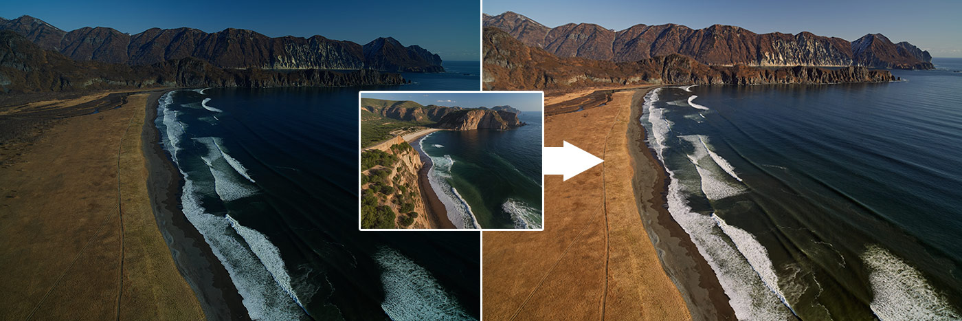
We have got a balanced and nice editing!
Now I’m going to try the same reference with this quite different image:
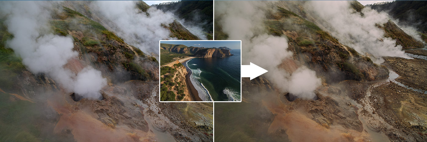
The color grading has a nice tone, but in general it’s a bad match.
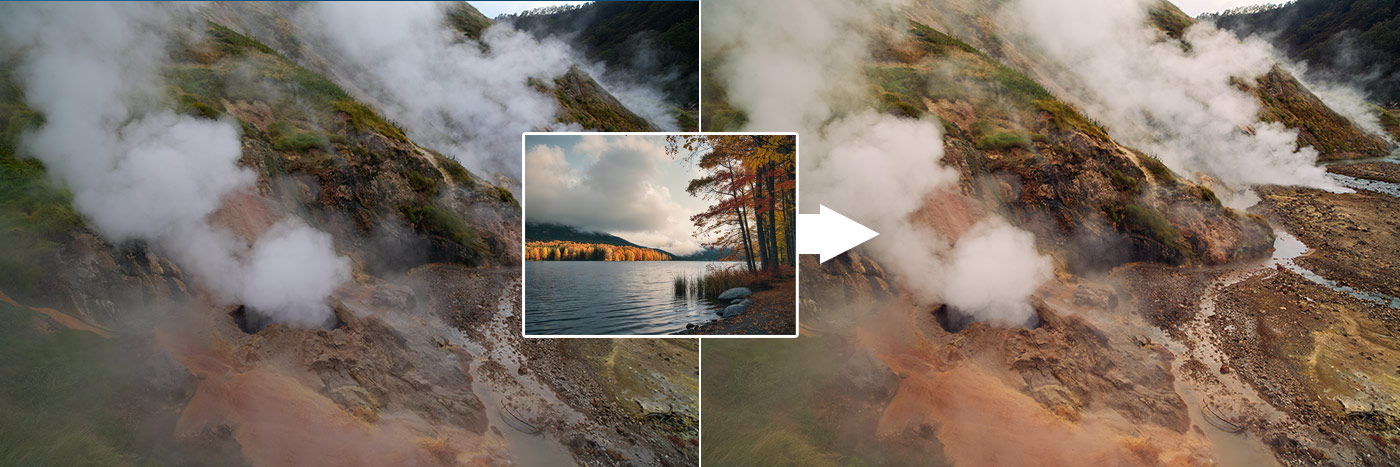
Let’s try to find a better reference for such an image. The tricky part is that you may not have a similar image of geysers!
In this case, you need to find an image with similar autumn colors and tonal distribution, like this image with many matching midtones:
To make it even better, follow rule #2:
Experiment with impact and adjustments.
Unlike portraits, landscapes can easily handle fairly high levels of Match Look impact. Try 65 as a starting point, then experiment with 90 or even 120 for some images.
Don’t forget that you can set a high impact, apply Match Look to a new layer, and then lower the layer’s opacity. This will actually give a different effect than a lower impact itself, so it’s a fun feature to experiment with:
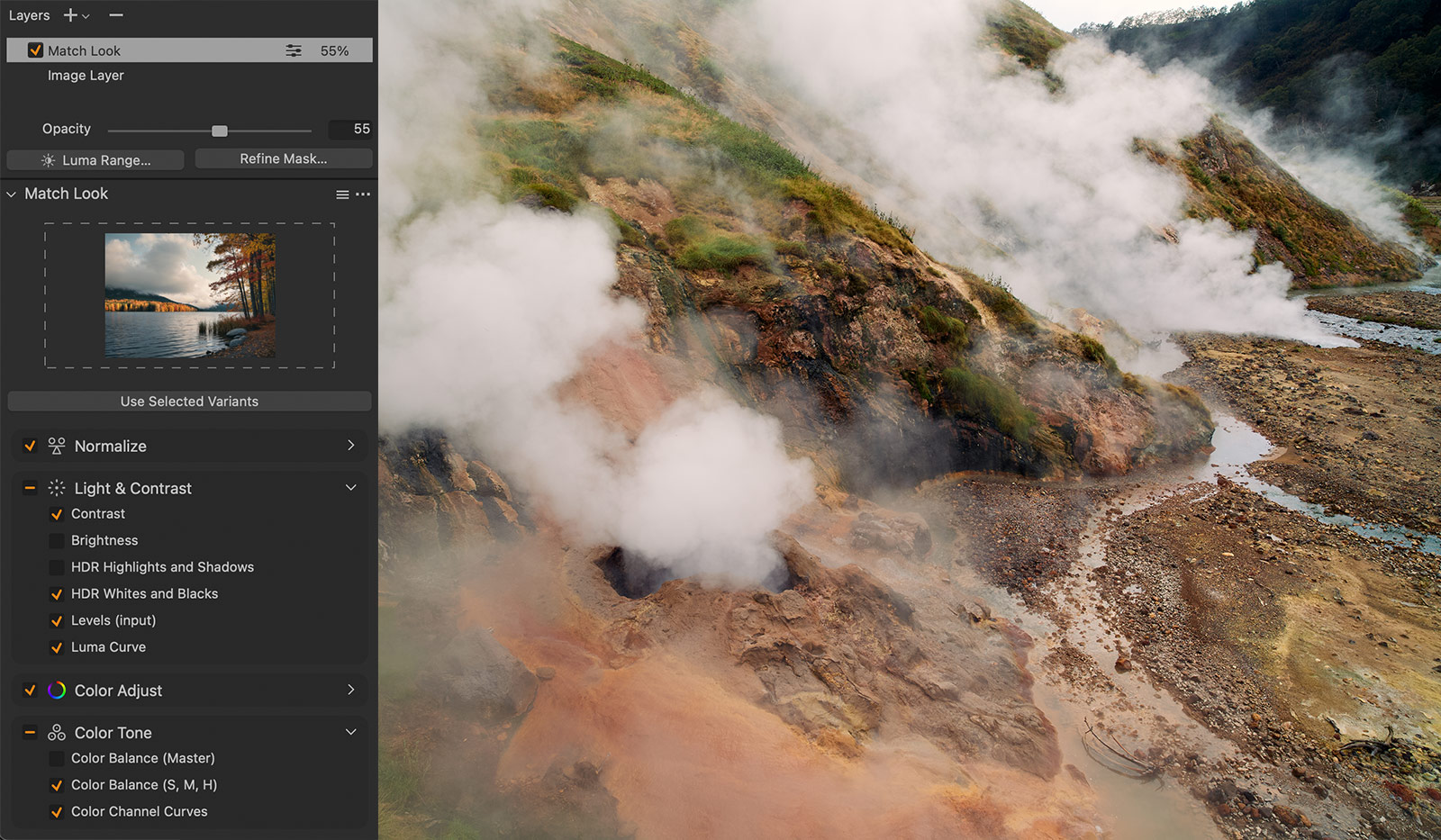
As for tools, my general rule for landscapes is to turn off Brightness, HDR Highlights and Shadows, and Master Color Balance adjustments.
Brightness and Highlights/Shadows are pretty bold adjustments that often make landscapes look flatter.
Master Color Balance affects the entire image – something I prefer to avoid in my editing and rely on more targeted tools like 3-Way Color Editor and Color Channel Curves.
Get Inspired by Legendary Film Shots
For my travel shots, I love to use legendary photographs like this sepia canyon with 50% opacity:
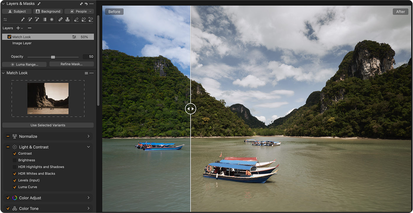
It gives a truly unique color grading solution that is pretty challenging to achieve from scratch.
I’ve tested dozens of iconic film shots with Match Look, and for the Adaptive Styles set, I’ve selected 10 iconic film looks that give the most interesting results.
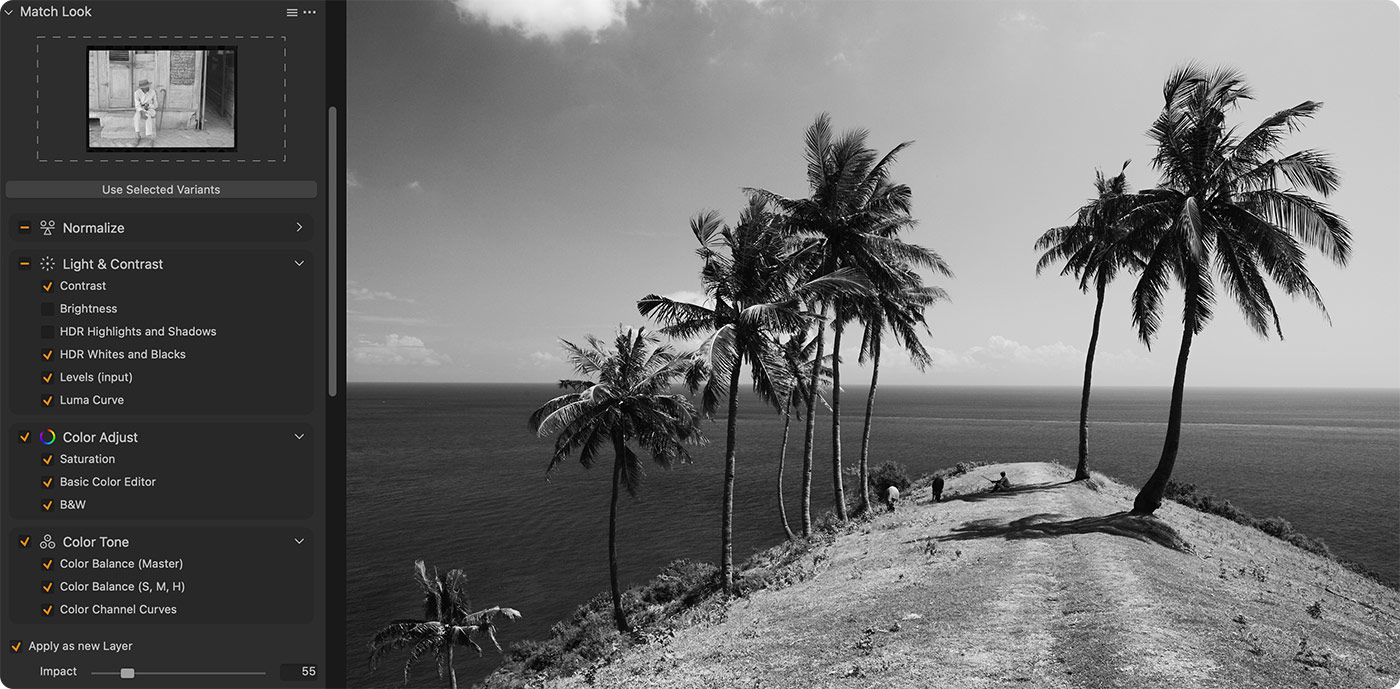
Some of them even inspired me to re-edit some of my old shots, as these B&W references offered looks I had never tried on my own images:
Finally, I have found that classic art is a perfect inspiration for landscape photography. That’s why the Adaptive Style set includes 10 art-inspired styles designed exclusively for landscapes:
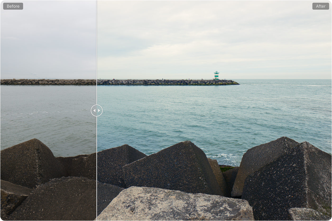
Again, don’t forget that you can apply them as layers and easily adjust the opacity:
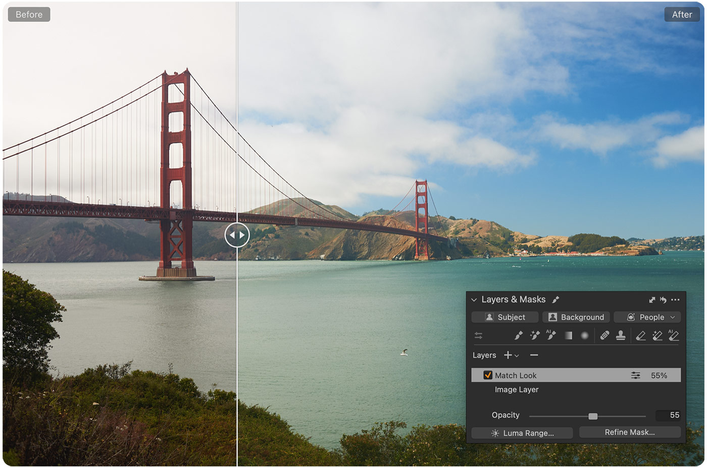
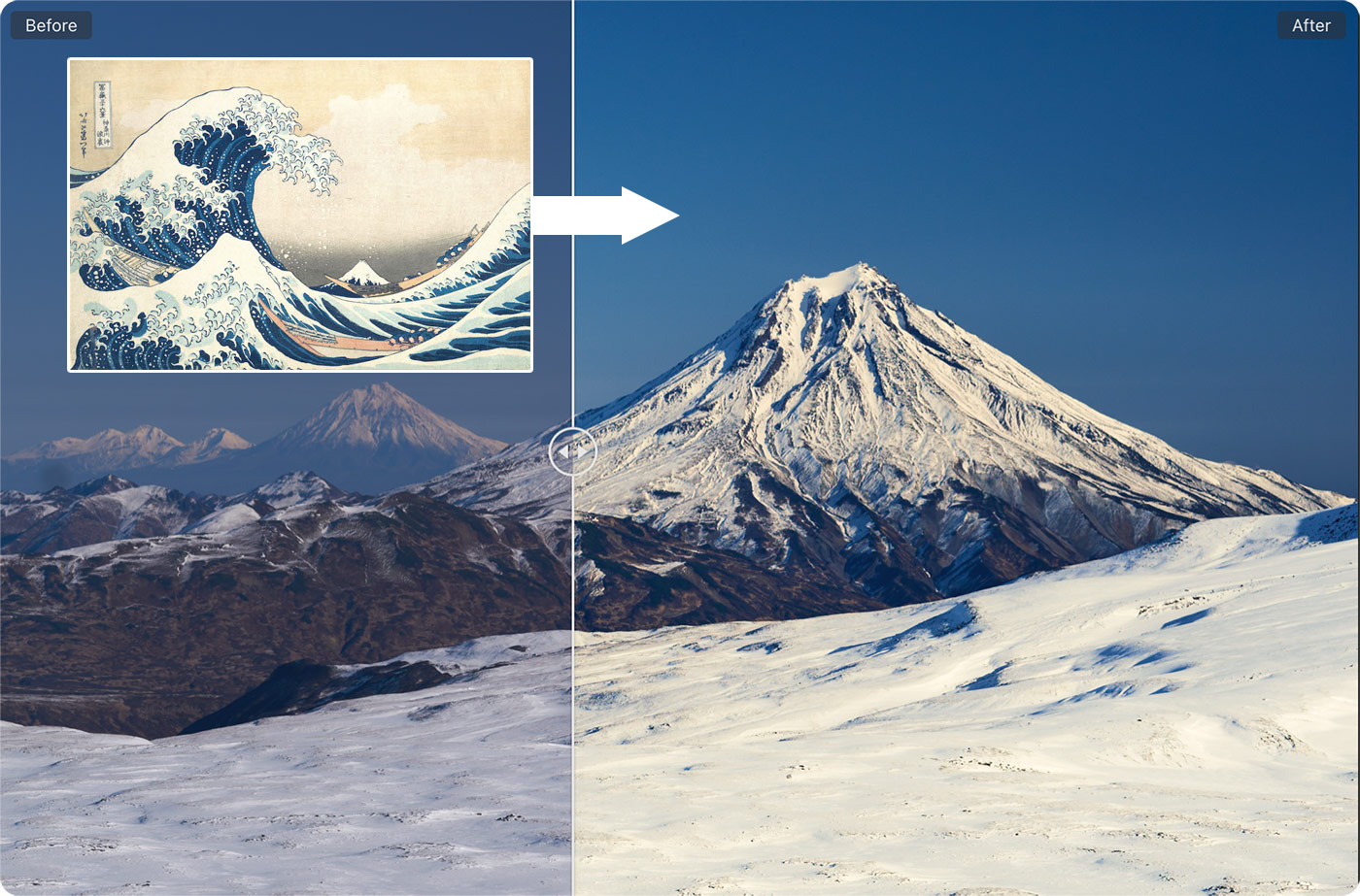
The most surprising discovery was that even rare techniques, such as Hokusai’s woodblock prints, work amazingly well for winter landscapes:
